
Your Website Looks Good—but Is It Actually Helping Your Business Grow?
Prosper Sibanda
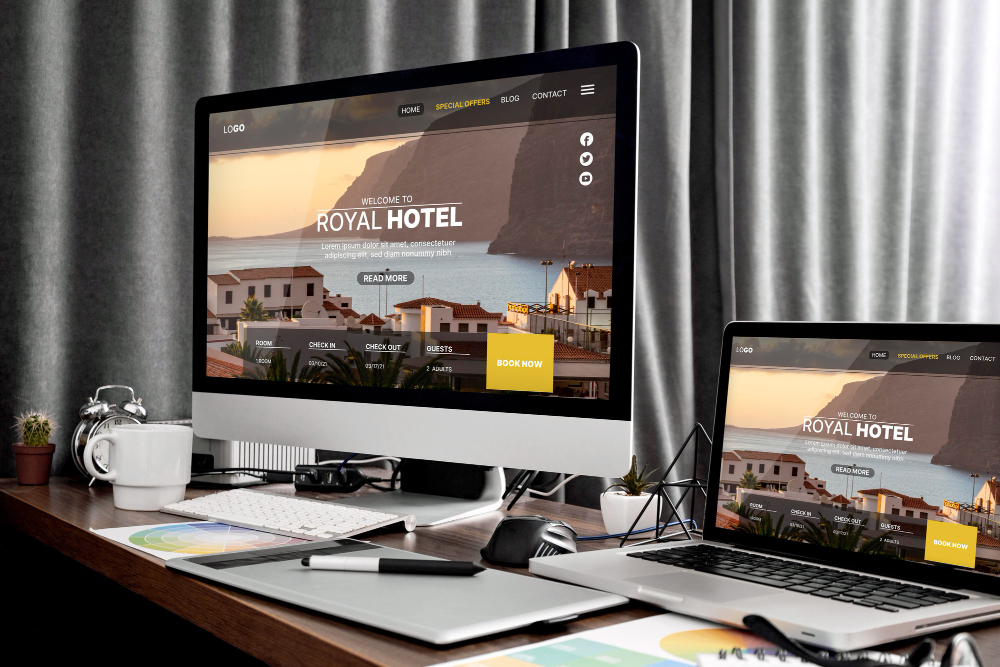
Your homepage has modern typography, polished photography, a confident colour palette and smooth animation. It looks professional. Yet the enquiries are inconsistent, visitors still ask what the business actually does, and the website rarely helps a sales conversation move forward.
That creates an uncomfortable question: is the website only attractive, or is it actively helping the business move forward? Appearance matters. Good design can signal care, quality and credibility. But appearance alone is not evidence that a business website is doing its job.
A successful website helps the right visitors understand the offer, trust the organisation, take a sensible next step and move closer to becoming customers. When those outcomes are missing, changing colours or adding another animation will rarely solve the real problem.
Looking professional is only one part of the job
Visual design shapes the first impression, but the website also needs a clear commercial role. Depending on the organisation, that role might be to generate leads, explain complex services, support sales conversations, qualify potential clients, encourage bookings, reduce repetitive enquiries, sell products, support recruitment or establish a stronger market position.
Problems begin when a site tries to do everything without deciding what matters most. The navigation expands, the homepage becomes a collection of competing messages, and every department asks for equal prominence. The result may look complete while giving visitors no clear direction.
Start with one practical prompt: if a visitor spends two minutes on your website, what should they understand, feel and do next? Your answer should be specific. “Know more about us” is too vague. “Understand that we help growing service businesses replace disconnected manual processes, trust that we can deliver, and book an initial consultation” is useful enough to guide decisions.
Without that clarity, a website can be visually finished but strategically incomplete. Design becomes more valuable when it supports a defined purpose rather than compensating for the absence of one.
Can visitors understand what you offer quickly?
Most visitors do not arrive with the patience or context of the person who commissioned the site. They scan. They compare. They try to decide whether the page is relevant before investing more attention. Vague headlines, industry jargon and broad claims such as “innovative solutions for a better future” make that decision unnecessarily difficult.
Other common problems include presenting too many services at once, failing to identify the intended audience, opening with a long company history, and describing internal capabilities without connecting them to a customer problem. None of these issues is solved by making the type larger.
Try a ten-second test. Ask someone unfamiliar with the business to view the homepage briefly, then answer:
- What does this business offer?
- Who is it for?
- Why might someone choose it?
- What should the visitor do next?
If the answers are unclear, the website may have a messaging problem rather than a visual-design problem. Strong messaging gives the design something meaningful to organise. It also makes every later decision—from page structure to calls to action—more coherent.
Is the website guiding people towards a meaningful action?
A visitor who understands the offer can still reach a dead end. Every important page should provide a logical next step: start a project, request a quotation, book a consultation, buy a product, schedule a demonstration, submit an application, contact the team or read a relevant explanation before deciding.
Weak calls to action tend to fail in predictable ways. There may be five competing actions with no priority, “Learn More” buttons that give no clue what happens next, a single contact link hidden in the navigation, or a long form demanding information before the visitor has enough confidence to provide it. A service page may explain the work thoroughly and then simply stop.
The stronger approach is contextual. After a high-level overview, “See how the process works” may be appropriate. After a detailed service page, “Discuss your website” is clearer. After pricing or product information, “Choose your package” makes the next step explicit. Not every section needs a sales button, but every important journey needs a sensible destination.
Does the website build enough trust?
Visitors often arrive with uncertainty. Is the business legitimate? Can it handle this type of work? Does it understand the problem? What happens after contact? Is the company still active? A polished interface can support confidence, but it cannot answer these questions on its own.
Trust grows when the website reduces uncertainty with clear business information, professional contact details, visible people, testimonials, relevant project examples, an understandable process, transparent service information, useful FAQs and appropriate policies. Consistent design and messaging reinforce those signals because they show that the business pays attention to its own presentation.
This does not mean a new business needs a vast portfolio before it can launch. Clarity, transparency, a credible process and honest presentation can establish an initial level of trust while stronger proof is added over time. Random logos, invented counters and vague claims do the opposite: they create more questions than they resolve.
A visually polished website can still underperform when its messaging, structure, user experience and conversion path are disconnected. Our Website Design & Development service brings these elements together around clear business goals.
Is the experience easy on mobile?
Responsive design is not simply desktop content squeezed onto a smaller screen. Mobile visitors may be using one hand, dealing with a slower connection, comparing options between meetings or trying to complete a form without a full keyboard. Their priorities and constraints are different.
Oversized headings, horizontal scrolling, awkward menus, tightly packed buttons, heavy video, long unbroken sections and sticky elements that cover content can turn a polished layout into a frustrating task. Forms deserve particular attention: if fields are difficult to select, the keyboard obscures instructions or an error removes entered information, people may abandon the enquiry.
Use an actual phone and complete the website’s key action. Find a service, submit an enquiry, buy a product, request a call or locate contact information. Do not only resize a desktop browser. If the task feels slow, confusing or physically awkward, the mobile experience needs work.
Is the website fast enough to keep people engaged?
Performance is a business issue before it is a technical score. A slow first view makes the organisation feel less prepared. Delayed buttons and shifting layouts make the interface harder to use. On mobile connections, heavy pages can consume time and data before the visitor sees anything useful.
Common causes include oversized images, unoptimised video, excessive animation, too many third-party scripts, poor hosting, unnecessary JavaScript, badly configured fonts and content that moves as it loads. These problems can affect first impressions, form completion, trust, search visibility and the likelihood that a visitor continues.
The answer is not to make every site minimal or animation-free. Visually rich experiences can be built responsibly. Images can be sized correctly, video loaded intentionally, motion used to support comprehension, and code delivered only when it is needed. The goal is not performance for its own sake; it is a smoother path to the information and action the visitor came for.
Can the right people find the website?
Search optimisation works best as part of the website system, not as a plugin added after launch. Search engines need the same kind of clarity as people: descriptive page titles, useful descriptions, logical headings, readable URLs, internal links and enough genuinely useful content to understand what each page is about.
A beautiful homepage is unlikely to rank for every service the business offers. Dedicated service pages create space to explain a specific offer, audience, process and outcome. Supporting articles can answer the questions people ask before they are ready to enquire. Clear market or local relevance, mobile usability, sensible performance, a sitemap and indexable pages complete the foundation.
This is also where thoughtful UX/UI design and a coherent design and development process support SEO. When information is organised around real visitor needs, search engines receive clearer signals and readers are more likely to continue through the site.
Does the website reflect the business you have now?
Businesses evolve while websites remain frozen. Services change, teams grow, positioning becomes more focused and the ideal customer shifts. The old site may still describe an offer that is no longer central, show obsolete team information, quote outdated pricing or present a freelancer-style identity for a company that now operates as a studio or agency.
Broken links and irrelevant portfolio work are obvious signs, but strategic misalignment can be quieter. A company may have moved upmarket while its messaging still competes mainly on price. It may now deliver complex engagements while the site presents isolated tasks. It may have strong expertise that is buried beneath years of accumulated pages.
In these cases, a redesign is not primarily about making the site prettier. It is about aligning the website with the business’s current direction so that prospects meet the organisation as it exists today.
A practical website effectiveness check
Review the questions below with evidence rather than instinct. Look at the actual pages, complete the journeys yourself and, where possible, ask someone outside the business to do the same.
- Can a new visitor understand what we do within seconds?
- Is the intended audience clear?
- Does every important page offer a logical next step?
- Is it easy to contact us?
- Does the website explain why clients should trust us?
- Is the mobile experience comfortable?
- Do pages load without frustrating delays?
- Can search engines understand our main services?
- Does the website reflect our current brand and goals?
- Can we update the content when the business changes?
- Are we receiving the type of enquiries we actually want?
Mostly positive answers suggest that the foundation may be strong, although individual pages can still improve. Mixed answers often point towards targeted work on messaging, structure, mobile usability or performance. Mostly negative answers suggest a strategic redesign may be more effective than a sequence of isolated visual fixes.
Redesign, improve or rebuild?
Targeted improvements
Targeted improvements suit a website with a sound technical and structural foundation. The priority might be clearer messaging, stronger calls to action, a revised service-page structure, better mobile behaviour, faster media or complete SEO metadata. Focused changes can produce a more useful experience without replacing everything.
Strategic redesign
A strategic redesign is appropriate when the technology still works but the experience no longer does. The visual system, content hierarchy, positioning and conversion path may need to be reconsidered together. This is more than a reskin: it is a deliberate reorganisation around present business goals and visitor needs.
Complete rebuild
A rebuild becomes sensible when the technology is outdated, maintenance is difficult, performance is consistently poor, major functionality is required, accessibility or mobile problems are deeply embedded, or the website must connect with new systems. Rebuilding costs more effort, so it should solve constraints that smaller changes genuinely cannot.
The website is part of a larger business system
Even an excellent website cannot guarantee leads or growth. Results also depend on the strength of the offer, market demand, traffic quality, pricing, brand reputation, customer service and the sales process that follows an enquiry. A site cannot create demand for an offer nobody wants or repair a poor customer experience after the form is submitted.
Its role is to support and strengthen those areas: communicate the offer clearly, make the business credible, help suitable visitors self-qualify, remove unnecessary friction and create measurable opportunities. Ongoing digital support can then help the site evolve as content, campaigns and business priorities change.
A website should have a clear role in the business
A website should not only look complete. It should communicate clearly, establish trust, guide action, work comfortably across devices, support search visibility and reflect the business as it operates now. Those qualities turn professional design from surface polish into a useful commercial system.
If your site looks good but is not creating the right conversations, the most useful next step is not automatically a rebuild. It is to understand what is holding the experience back, decide whether targeted improvement, strategic redesign or new development is appropriate, and invest at the level the problem requires.